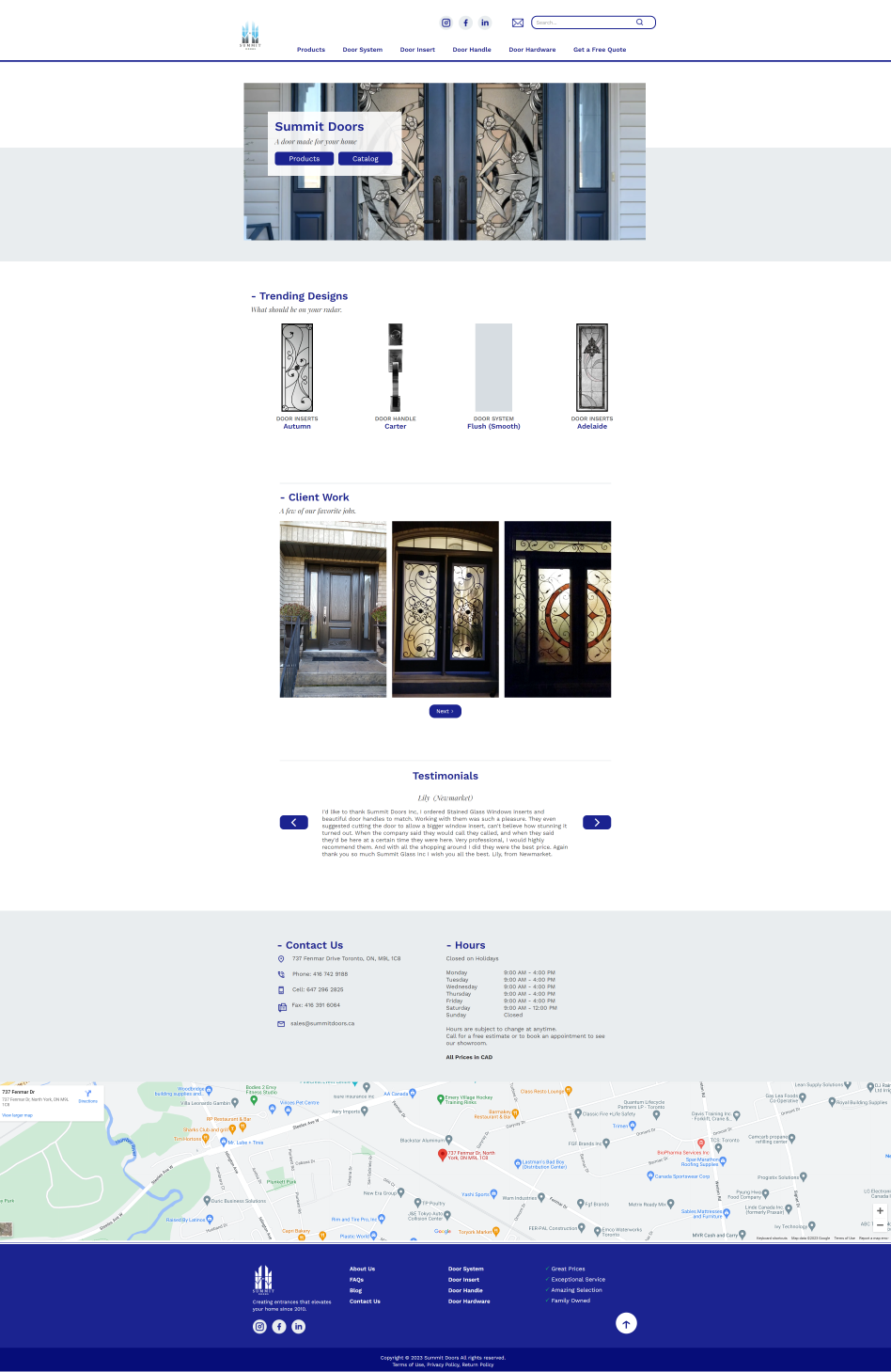
Project: I was tasked with refreshing the Summit Doors website.
| Year: 2023 | Program Used: Webflow, Figma, Adobe Photoshop & Illustrator | Link: www.summitdoors.ca |
Homepage:
- Spacing: There was a lack of white spacing; I added breathing room in the newest version. There is also a clear delineation in new sections with lines and using background colour.
- Headings: I ensured the style of headings was consistent.
- Visual Impact: I revised the heading to be concise, fill the space, and have a better call to action. The previous one where the same link.
- New menu: The menu now reduces the number of clicks to get to the product page and has additional functionality with the search bar and social media links.
- New sections: With more focus now on the projects, I added the trending designs and client works section. I moved the about us to its one page, and the four sections are now menu items, as mentioned before.
| Before | After |
Product Page
This is where the majority of the work was done.
- Above the fold: Instead of having the images rendered on a single page. I used pagination to keep it above the fold and, in addition, render it as the user goes to the next page. Thus, reducing load time.
- Filtering: The old webpage has the entire categories and subcategories on the product page. The filtering system was at the bottom and could only be reached when a user scrolled to the bottom. This was not a friendly user experience. I reduced the number of categories and subcategories to those necessary and had the filtering system the first item you see. I used drop-down items to keep the design clean.
- Additional information: The old design didn’t have the info if the product was out of stock, low in stock, or a popular item. I added these to the new page.
- Optimizing Images: I converted all the images to the new format webp for faster loading and fixed the issue of images not showing up if it’s not the main image.
| Before | After |
Individual Product Page
- Information Consolidated: Product information was dynamically linked in a CMS, allowing me to ensure all relevant information appeared on the individual product page. The information was now on the right side instead of having it in multiple places.
- Recommendations: I added the feature of recommended items to drive sales and improve the user experience.

Leave a Reply
You must be logged in to post a comment.