
Truthfully, you cannot do this natively with a single collection in WebFlow. You need a bit of code to make this work. Here’s two ways to do it:
Number 1:
Thanks to jasondark on the WebFlow forum for this solution. Insert the following code in the head of the page where the CMS collection lives.
<style>
    @media screen and (max-width: 991px) and (min-width: 768px) {
        .w-dyn-items :nth-child(n+11) {
            display: none;
        }
    }
</style>
The second line where it says @media screen, you specify the break point. Here are the following breakpoints in webflow:
Base Breakpoint: 1593 px
Tablet: 991 px – 768 px
Landscape Mobile: 767 px – 479 px
Portrait Mobile: 478 px and down
So you replace the max width and min width, with the different breakpoints. Then the in the next line where it says w-dyn-items: nth-child(n+11). Replace 11 with whatever number you want to show at that breakpoint.
copy the @media screen till the none; for different breakpoints.
If you have more than 1 CMS collection on the page and you only want to target 1 specific collection, swap out the class .w-dyn-items for the class you gave the element that wraps all your CMS items in Webflow.
Note: If you have pagination, I would not recommend this method and you should the do the one below.
Number 2
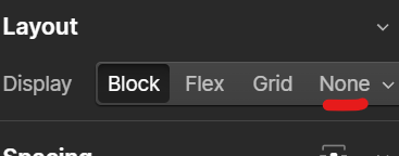
This way is a bit tedious but it doesn’t need code. You will need to have multiple CMS collection list and then using display none, change for each breakpoint. You can find it in the style panel.
Bonus
This method does not alter the item count at various breakpoints; instead, it improves the visual arrangement of the collection list. By adjusting the width of the items, you can ensure they occupy less space on the page, enhancing the overall layout.
This video tutorial explains how to adjust the min/max width of the grid.
https://www.youtube.com/watch?v=4u1sD7GcGoQ
Happy creating!
Leave a Reply
You must be logged in to post a comment.