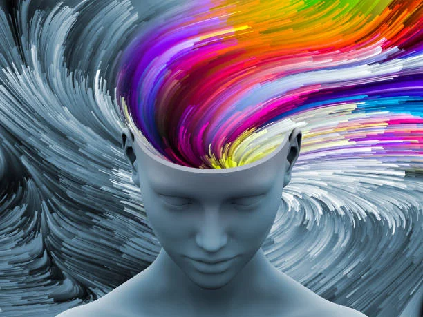
Color psychology in branding and design is a fascinating and intricate field that delves into how color influences consumer behavior, emotions, and overall perception of a brand. As we navigate through the bustling aisles of a supermarket or scroll through an endless sea of digital content, our decisions are subtly guided by the colors that brands use to represent themselves. This article explores the significance of color psychology in branding and design, providing insights into how specific hues can affect consumer behavior and evoke emotional responses.
Understanding Color Psychology
Color psychology is the study of hues as a determinant of human behavior. Colors have the power to influence perceptions and emotions significantly. This is because colors are processed by the brain, which triggers certain reactions. For instance, warm colors like red, orange, and yellow can evoke feelings of warmth and comfort but also anger and hostility, whereas cool colors like blue, green, and purple are often associated with calmness and sadness.
The Impact of Color on Branding
When it comes to branding, the choice of color is critical. A brand’s color can make it stand out, convey its message without words, and significantly impact its recognition by consumers. A study titled “Impact of Color on Marketing” found that up to 90% of snap judgments made about products can be based on color alone.
Examples of Color in Well-Known Brands
- Red in Coca-Cola: Coca-Cola’s use of red is one of the most iconic examples of color psychology in branding. Red is a powerful color that can stimulate appetite, grab attention, and evoke strong emotions. Coca-Cola’s red is vibrant and inviting, encouraging feelings of excitement and passion, which aligns perfectly with the brand’s message of sharing and enjoyment.
- Blue in Facebook: Blue dominates the branding of Facebook, and this choice is no accident. Blue represents reliability, trust, and communication. It’s a calming color that encourages interaction and trust, aligning with Facebook’s goal of connecting people across the globe.
- Green in Starbucks: Starbucks uses green to symbolize growth, freshness, and prosperity. Green is often associated with health and tranquility, reflecting Starbucks’ commitment to ethically sourced coffee and creating a relaxing environment for customers.
- Yellow in McDonald’s: The bright yellow used by McDonald’s is visually stimulating and associated with happiness and friendliness. This color helps create a welcoming atmosphere, aiming to attract families and young customers.
Color and Consumer Behavior
Color not only affects brand recognition but also influences consumer behavior. It can affect how consumers perceive the quality and value of a product. For example, black is often used in luxury product branding to evoke feelings of sophistication and elegance. In contrast, earth tones like green and brown can be used to promote eco-friendly products, appealing to consumers’ growing environmental consciousness.
The Cultural Context of Colors
It’s crucial for brands to consider the cultural context of colors, as perceptions of color can vary significantly across different cultures. For instance, while white is associated with purity and peace in many Western cultures, it is often associated with mourning in some Eastern cultures. Therefore, international brands need to carefully choose their colors to ensure they resonate positively with their target markets worldwide.
The strategic use of color in branding and design is a powerful tool in influencing consumer behavior and emotional responses. By understanding color psychology, brands can create more effective marketing strategies, enhance brand recognition, and forge deeper connections with their audience. As consumers become increasingly visually oriented, the role of color in branding and design will only grow in importance, making it a critical consideration for any brand looking to make a lasting impact.

Leave a Reply
You must be logged in to post a comment.